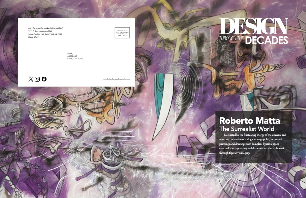
Design Through the Decades
Featuring Roberto Matta
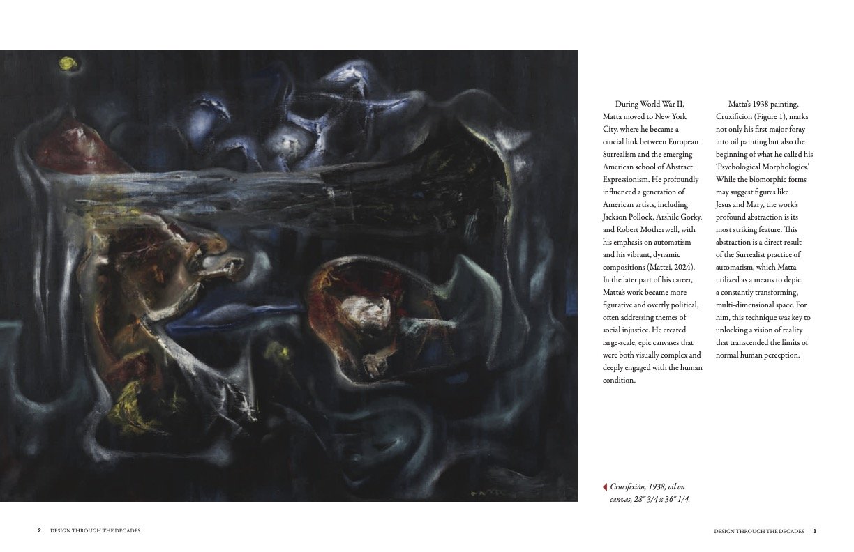
The objective was to design and produce an 18-page (9-spread) magazine for "Design Through The Decades." The primary challenge was not just to create an editorial layout, but to synthesize and unify a series of assets created for this project. This included integrating a feature article, applying review edits, implementing a specific typographic scale, and incorporating an original logo, all within the technical constraints of a print-ready Adobe InDesign document.
Process Overview
The project began by establishing the 18-page, 8.5"x11" facing-page document in InDesign, complete with margins and columns. The core constraint was choosing the right layout grid for the project to serve as a grid system, which forced a varied approach to the layout. The core constraint was a requirement to design each of the eight interior spreads using a different grid system, which forced a varied approach to layout.
My workflow involved:
Content Integration: Flowing in the edited article text.
Typographic System: Establishing paragraph and character styles based on the pre-defined type scale to ensure consistency across all 18 pages for headlines, subheadings, body copy, and captions (demonstrating at least three levels of hierarchy).
Layout Design: Systematically building each spread on a new grid, balancing text blocks with imagery and negative space.
Asset Creation: Creating two original digital illustrations in Adobe Illustrator and sourcing five high-quality, relevant images.
Branding: Integrating the custom logo onto the cover and as a secondary branding element within the interior.
Production: Meticulously checking for overset text and broken links, then packaging the final InDesign file and exporting a high-quality print PDF.
Research Highlights
This project's research was focused on application and synthesis rather than new topic discovery. Key research-based actions included:
Layout Research: Researching and implementing eight distinct editorial grid systems (e.g., column, modular, baseline, hierarchical) to ensure each spread was unique while remaining functional.
Visual Curation: Sourcing high-resolution photographs that were thematically appropriate for the article's subject and licensing-compliant.
Content Refinement: Analyzing and methodically applying peer feedback to improve the clarity and flow of the original article.
Deliverables
The project concluded with the submission of two primary professional-grade files:
A high-quality, print-ready PDF: A single 18-page file containing the full-bleed cover, back cover, and eight unique interior spreads.
A packaged InDesign folder (.zip): A compressed folder containing the final .indd file, all document fonts, and all linked assets (images, illustrations) for professional handoff.
Results
The final product is a cohesive, 18-page magazine that successfully balances layout variety with a strong, unified brand identity. The typographic system and consistent branding elements act as the "glue" that holds the diverse grid structures together, creating a professional and engaging reading experience. All technical specifications, from image resolution to file packaging, were met.
Reflection
This project was a comprehensive exercise in creating and managing a design system. The most challenging aspect was the constraint of using eight different grids, which could have easily resulted in a disjointed or chaotic final product. This challenge forced me to rely heavily on the typographic hierarchy and consistent styling to maintain cohesion. It solidified the importance of "rules-based" design, where a strong underlying system (like paragraph styles and a type scale) allows for greater creative freedom in composition. Finally, it provided practical, real-world experience in the technical production workflow (packaging and exporting) required for print publishing.


